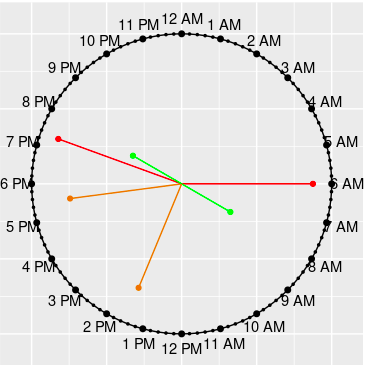
Week Chart
week_chart.RdThis function plots values corresponding to each day on a rose plot.
Arguments
- wvalue
A numeric vector having values on each day, starting from Saturday
- lgnm
Title of legend
- high
The color name for the high values. The default is
red- low
The color name for the high values. The default is
green. The color names can be vice versa or other colors, depending on the context.- width
The width of bars.
See also
day_chart() for plotting values in on a day hours
year_chart() for plotting values on in a year by months
cyclic_chart() for plotting values by arbitrary period